Everywhere A Sign
 If you are like me you tend to notice errors in historical signs. I don’t just mean misused apostrophes and spelling mistakes, but signs with inaccurate dates or facts. Up until a few years ago my favorite local sign was the plaque under Buffalo’s own copy of Michelangelo’s David. Not only did it mess up the artist’s birth and death years, it credited the sculptor as “Michel Angelo.” You know, of the artistic Angelo family.
Our attempt to be classy and erudite took another hit. (Building an expressway between David and a bust of Mozart was the first blow.) Local Italians were not too impressed, either. They complained to local government and a new, corrected plaque now adorns the pedestal.
My search continued for a new favorite and frustrating local sign. Frontrunners have not been permanent displays. A Buffalo History Museum exhibit on US Presidents declared that John Kerry won the popular vote but not the electoral college over George W. Bush in 2008. How soon we forget!
 A more recent showcase at the Buffalo Central Library focused on book publishing as art. One book, Jimmy Corrigan: The Smartest Kid on Earth incorrectly captioned the main character as “Billy Corrigan.” I assume the person who typed that caption was my age, subconsciously thinking about Smashing Pumpkins lead singer and guitarist Billy Corgan, who is also bald and thinks he’s the smartest kid on earth.
These errors aren’t big or embarrassing; this blog post probably has much worse. And the exhibits were very well done, educational, and entertaining if not 100 percent perfect.
Last week, however, I walked along the waterfront and remembered one sign that always bothered me. It isn’t historically or grammatically incorrect. It doesn’t suffer from a committee mentality, either, where the text and images are tortured to irrelevance and too much space lists donors and sponsors.
The sign is not this sign, but located right next to it:

And below is the sign in question. The “You Are Here” mark is on the leftmost end of the map. You can click on it for a larger image:
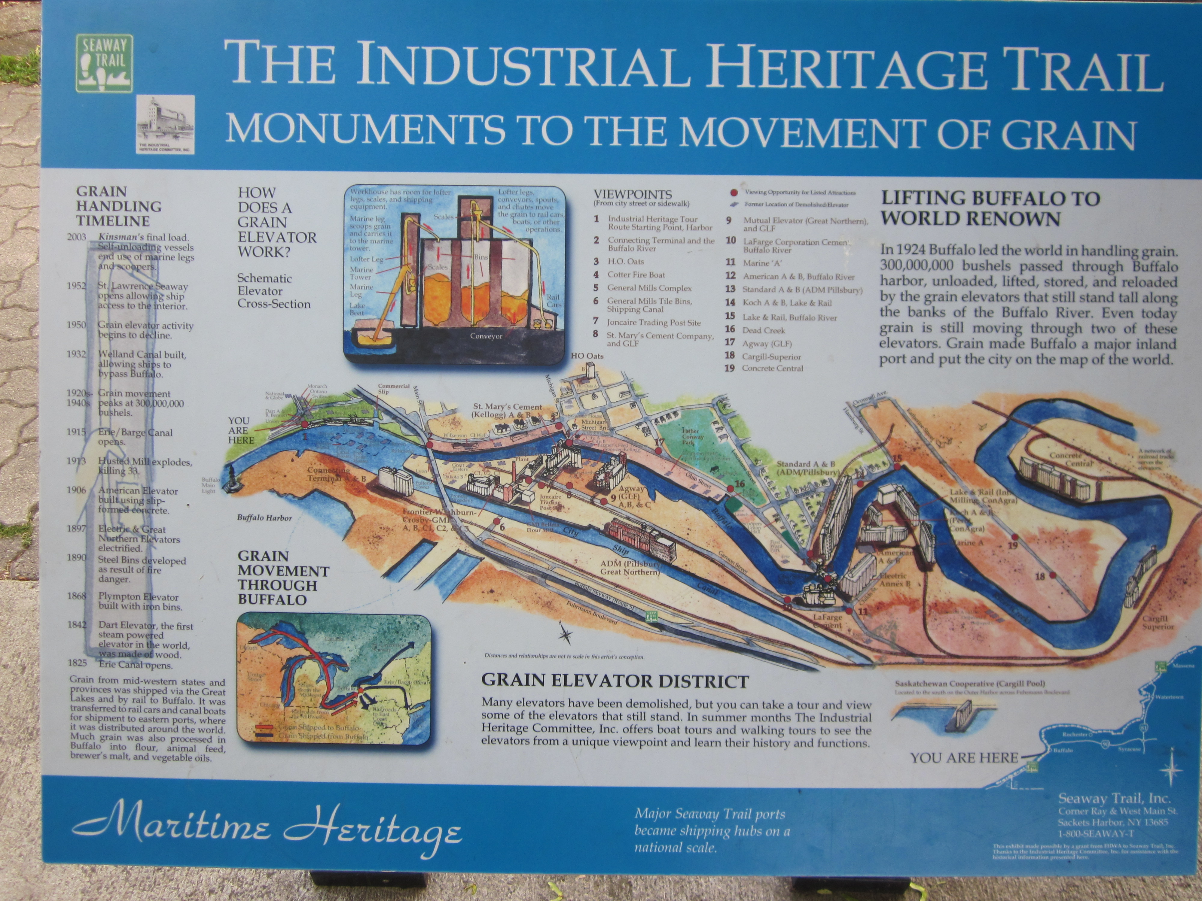

The sign’s subject is the grain elevator industry which first began on that spot in the 1840s. It even diagrams how a grain elevator works on the inside. But here is what surrounds the sign. Where are all the elevators? While the sign mentions that many elevators are demolished or inaccessible, it also lists the very spot as a “Viewing Opportunity for Listed Attractions.”
So over here–on the visitor’s right–should be a bunch of grain elevators to look at, right? That is, until the visitor realizes the map is upside-down in relation to their location. Lake Erie is to the west, not the Buffalo River. Only one grain elevator is really in the vicinity, but not close.
Several years ago the waterfront was not well developed and tourist-friendly locations were sparse. The Industrial Heritage Committee made an informative sign, it’s just on the wrong side of the river. Imagine not being from the area and visualizing this after navigating the spaghetti system of roadways leading to the Erie Canal Harbor. And since the average person will not see the river terminate from that vantage point, they may consider the map as-is and travel the wrong way. Speaking from experience, most locals don’t know the difference between the Buffalo River and the City Ship Canal. They’re disoriented, too.
I suggest moving the sign somewhere else–perhaps somewhere near the Ohio Street Bridge–with the sign looking north instead of south and with a quick edit to “You Are Here.” With all the new interest in Silo City it’s bound to get some fresh readers.
P.S.: For more maps of Buffalo’s grain elevators, as well as some legal-or-otherwise travel tips, visit Buffalo History Works’ Grain Elevators: How to See Them.


Leave a comment